The problem
Plans change after a flight is booked, and until recently the passenger absorbed that on their own.
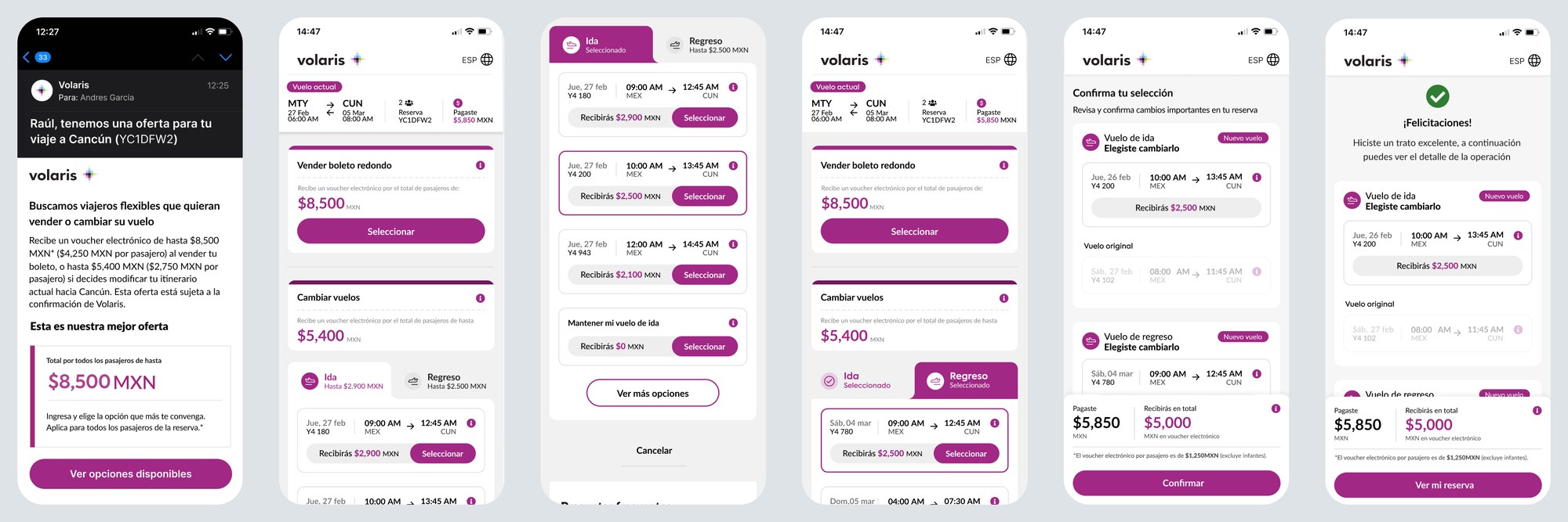
Volaris offers a way out, run together with Travel X, a partner platform. Passengers on eligible flights receive an email with two options: sell the ticket back in exchange for an electronic voucher, or move to a different date and keep a voucher for the difference. Everything happens on Travel X's side, from the email to the change flow. For someone whose trip got cancelled or moved, it's a real alternative to losing the flight altogether, and the released seat goes to a passenger who needs it.
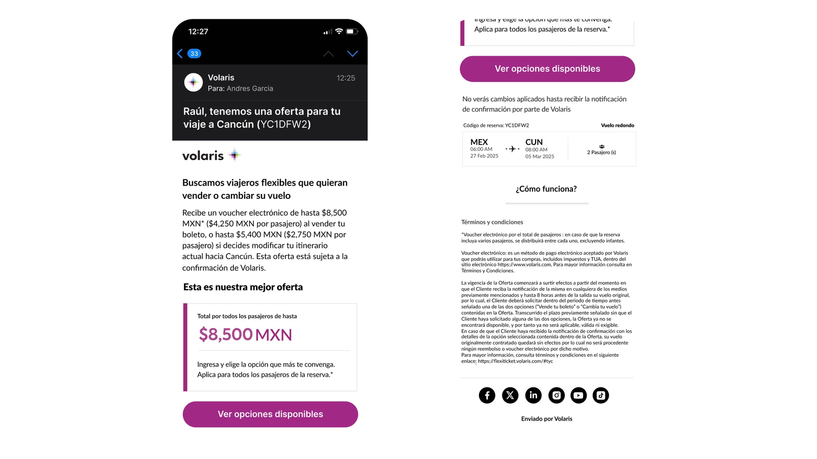
The catch is how the offer arrives. It comes unannounced, by email, offering money back on a flight already paid for and handing you off to a site that isn't Volaris's, which is also a fair description of a scam. And because the whole experience lives on the partner's platform, any improvement had to be negotiated through the partnership rather than built inside our own product.
- Why do some passengers accept the offer while others ignore it?
- Is the flow clear enough for people to understand what they gain and what they give up?
- Where does the experience break down, and what keeps people from trusting it?
Research approach
I split the study into two groups, because each could answer a different half of the question.
Passengers who didn't convert → moderated usability tests
Five participants, aged 24 to 49, went through a realistic scenario: a week before a trip, they receive the offer email and explore the flow in a Figma prototype. This showed where the experience lost them.
Passengers who converted → in-depth interviews
Five participants, aged 28 to 68, walked me through their real experience with the help of screenshots. This showed what motivated them and what almost stopped them.
Synthesis
I built archetypes for both groups, compared needs and reactions across profiles, measured satisfaction with NPS, and organized recommendations by screen and by effort.
The ten profiles, side by side
Comparing them is where the pattern showed up. Both groups asked for the same thing from different distances: the people who didn't convert needed to understand enough to feel safe acting at all, and the people who did needed to understand what they had just received. Previous experience with vouchers predicted neither reaction.
The flexible, frequent traveller
Participant U1Clear information, without over-explaining.
I usually have flexibility because I always travel with my laptop, so it's easier and I can change my flights often.
The traveller limited by work
Participant U2Transparent pricing and clear options.
If something comes up at work it's really hard to move it, and the times and prices change so much that I'd rather cancel.
The practical, family-oriented traveller
Participant U3Plain language and trust in the process.
If it's an option that works for me for some reason, I feel like I'm not losing anything, I'm gaining something.
The digital-savvy, detail-oriented traveller
Participant U4Consistent communication; trust breaks the moment something feels off.
It was all very clear until the voucher part… that's where it stopped making sense to me.
The occasional, visual learner
Participant U5Visual, step-by-step explanations before acting.
I'd like it explained to me as if I were five, so I wouldn't have doubts before doing anything.
The retired social traveller
Participant U6Understand the benefits, and a simple way to manage the change.
Now that I'm retired I travel a bit more; I take the chance when friends invite me over.
The logical planner with family constraints
Participant U7A fast, clear process that works properly on mobile.
We mostly travel to go with my dad when he's away for work.
The cost-aware short-trip traveller
Participant U8Transparency about conditions and limitations.
I only accepted because it didn't mean spending more; if it had meant an extra night of hotel, I wouldn't have taken it.
The structured tech professional
Participant U9A clearer explanation of how the voucher works and when it can be used.
I had to adapt to the options, but I had already spent money and sorted out logistics; I'd like there to be more alternatives.
The job-seeking flexible flyer
Participant U10Clarity about the voucher's restrictions: amount and validity.
Right now I could stay a few extra days, and if I travel more in the future this kind of service works for me.
Recruiting was a project of its own. I wrote the invitation emails, requested the list of eligible passengers from Travel X, and coordinated with Marketing to send about 2,700 invitations in three waves. Then came days of waiting for responses, plus no-shows that I had to follow up one by one to reschedule.
The Travel X designer joined every session as note-taker. We discussed findings together as they emerged, and he could jump in during sessions to explore something a participant said. Some of what surfaced were issues with the platform and emails that his team didn't know about.
Key insights
The offer looked like a scam
Several participants said an unexpected email offering money for their flight felt fake, or like a trap. Before anyone could judge the offer, they had to believe it was real.
Gains were read as losses
At first, participants read the price difference between flights as money they would lose. Several also misunderstood the total compensation, and weren't sure how or where they would receive it.
Flexibility has to go deeper
Participants wanted to change the flight for some passengers on the booking but not others. The "keep flight" option was confusing and not visually distinct.
Help needs to be immediate
When doubts came up mid-flow, like what would happen to their seat or add-ons, email support felt too slow. Older participants often missed the info icons that younger ones used naturally.
One technical detail broke the whole flow
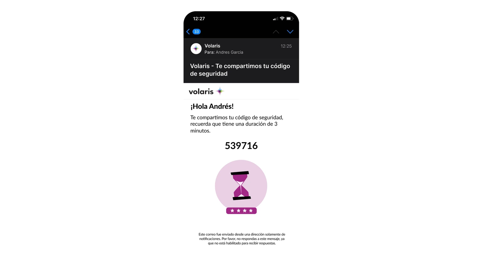
The verification code arrived by email, but the page opened inside the email app. To see the code, users had to switch screens, and when they came back they had lost their progress.
Passengers who converted were happy
NPS was 8.7. What held scores back was unclear voucher conditions, restrictions on add-ons purchased earlier, and the lack of a direct way to get help.
The turning point
The usability issues were real, but they weren't the main barrier.
The biggest problem happened before the interface: in the first message.
That changed the conversation with both teams. Fixing the email alone wouldn't be enough. We had to look at every touchpoint where passengers could meet the offer, and use all the channels Volaris already had to make it feel official and easy to act on. I presented the findings to Volaris's stakeholder in charge of the Travel X partnership, and the Travel X designer shared them with his team.
Outcome
Several changes have already shipped:
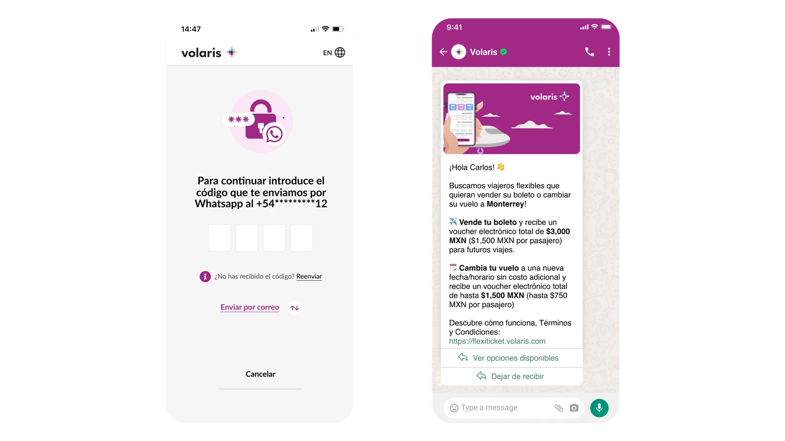
- Verification moved to WhatsApp. The broken code step became a single, familiar interaction, and it also signals an official channel.
- A new in-app entry point. Eligible passengers now see the offer directly on their flight in the Volaris app. Because it appears inside Volaris's own app, it's clearly legitimate.
- Clearer copy. The flow now explains what passengers receive, and how and where they receive it.
- A lighter visual design, toning down the intense purple participants found overwhelming.
- A multi-step email journey, where each email has a single job: explain the service, present the offer, follow up, and explain how it could help next time.
Verification, before and after
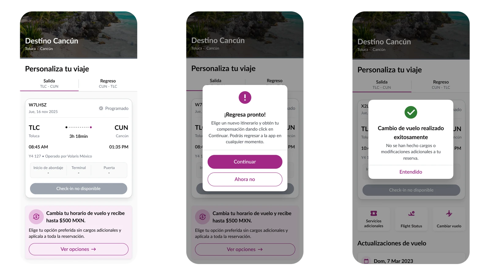
The offer inside the Volaris app
The entry point passengers trust most turned out to be the one they already had open. On an eligible flight, the offer now appears on the trip itself, explains what it involves before anyone commits, and confirms afterwards that the change is already reflected in the booking.
In progress: a virtual assistant to answer questions in real time, like what happens to a seat or add-ons after a change. Changes for part of a booking remain under review, since splitting one booking involves the reservation system, extra steps and business rules.
Beyond this study: I'm now working on bringing features passengers already know from Volaris's own site to the partner platform, like changing to other airports in cities with more than one, and sorting results by schedule, so moving between both platforms doesn't feel like an abrupt change.
What I'd measure next
Offer conversion by channel (email, WhatsApp, app), completion and drop-off at each step, voucher redemption, NPS over time, and support contacts about the service.
Reflection
Design the whole journey, not just the screen
We started by reviewing the first touchpoint, the email, but we didn't stop there. Solving trust meant designing holistically across every channel we had.
Research through a partner works best when they're in the room
Having the Travel X designer in every session surfaced issues his own team didn't know about, and made recommendations far easier to act on than a report would have.
Recruitment needs its own plan and timeline
Recruiting real passengers outside a panel is slow, and on a tight deadline it can push back results. Since then I use tools that automate reminders, calendar invites and follow-ups for no-shows.
Study who says no, not just who says yes
Passengers who converted explained what works; those who didn't explained what's missing. Either group alone would have given half the picture.