The problem
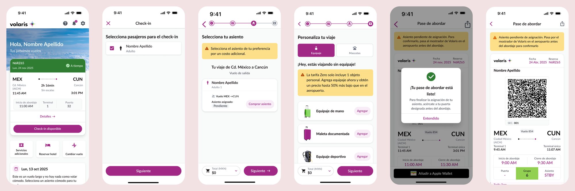
Passengers who bought only a ticket, with no seat and no baggage, couldn't check in digitally.
They had to go to the airport counter where checked bags are dropped off, which is a slower process. The result was long lines and crowding at the airport. Airport Operations asked for a change: let these passengers check in and get their boarding pass in the app, with the seat assigned by airline staff right before boarding.
That solves the operational problem and creates a new one for the passenger. A boarding pass without a seat can read as you might not get on this flight. It can sound like overbooking, like an error, or like something the passenger did wrong. And we couldn't design our way around it by promising a seat that didn't exist yet. The only option was to be honest about uncertainty and make it feel safe.
My team had already designed the flow. Together with the UX Writer, I reviewed the pending-seat messages before, during and after check-in, including the modal, to make sure they informed passengers without alarming them while staying honest. Then my job was to find out whether all of it worked before this reached real passengers.
Research approach
I ran an unmoderated usability test with 11 participants in Mexico, aged 20 to 59, with a mix of travel frequency, from frequent flyers to people who had never flown. They completed the check-in flow, and I tracked where they clicked and how long they took. Follow-up questions and a survey captured what they understood and how they felt.
Combining behaviour with self-reported emotion mattered here. Click paths would tell me whether the flow worked; only their own words would tell me whether the experience was acceptable.
Key insights
The flow worked
8 of 11 participants completed the task and reached the boarding pass, in about 2.5 minutes. They rated the final message 4.0 out of 5 for clarity.
A number leaves room for misreading
64% understood "Seat: 0" as no seat assigned yet. The rest didn't: some read it as a system error, and one participant set out to find seat number 0 on the aircraft.
"Pending" was read as "pay"
Several participants clicked the "Buy" button as soon as they saw the pending status. In the prototype the button wasn't active; in the live flow it stays available for passengers who do decide to buy a seat.
Clear instructions, unwanted outcome
Participants understood the instruction: go to the counter. But 45% concluded the real fix was to buy a seat next time, 27% said they would go to the counter to have one assigned, and a few still expected the seat to appear on its own.
Negative emotions, correct understanding
Participants described feeling uneasy, confused and uncomfortable. The recurring fear was losing their place on the flight; several also worried about not sitting with the people they travel with.
Trust took a measurable hit
Confidence that the airline would resolve the seat assignment averaged 3.55 out of 5, and likelihood to choose the airline again averaged 3.27 out of 5.
The turning point
The results pointed to two different decisions. Clarity said ship it: people understood the message, followed the flow and knew what to do. Emotion said think twice: the same people didn't want this experience, and their trust and loyalty scores showed it.
How did you feel getting a boarding pass with no seat number?
Uneasy, with the feeling that I could miss the flight because they might deliberately give my seat to someone else.
I felt really bad, because I probably wouldn't be able to take the flight.
I don't like it.
Unsure — I'd immediately try to contact the airline to get the situation cleared up.
If I'm travelling with someone I'd feel frustrated, because I like to sit next to the people I'm with.
Unhappy about it.
Odd, because normally when I check in it gives me a seat number, even if I didn't pick one.
Odd — it doesn't guarantee me a spot.
Confused.
Fine. I didn't pay for one.
Every answer to the same question, placed on a scale. Nine of the ten sat on the uncomfortable side.
The 45% who said they'd buy a seat next time captured the tension exactly. From a revenue standpoint it looks like a win. From a passenger standpoint, it means paying to avoid anxiety.
The design was as good as this scenario allows. The remaining discomfort comes from the rule itself, not from the interface.
So my recommendation wasn't a set of UI fixes. I framed it as a business decision: weigh the operational benefit of standby seat management against a measurable risk to trust and loyalty, and consider whether the rule could be adapted to serve the same need with less impact on passengers. A call like that isn't design's to make alone. I took the results to the stakeholders and to the managers and directors of the Digital area, because both sides had to be weighed together: the passengers, whose experience I was there to put on the table, and the operational value the change was built to deliver.
Outcome
The seat field went through three versions. What we tested showed "Asiento: 0". Most people read it correctly, but the results also showed that keeping it meant accepting a small share of passengers who would board looking for a seat numbered 0.
In the session where I presented the findings, a dash came up as the alternative: the convention passengers already know from fields with nothing to show yet, like the gate. It was discarded for a reason of its own. A dash suggests the value will fill itself in later, or that something failed to load, and neither is true here.
The version that shipped reads STBY, and it serves two readers at once. The passenger takes the real instructions from the alerts and the modal, and sees a field that looks complete rather than broken. A gate agent reads STBY as "this passenger is on standby and the seat gets assigned here", not as a technical failure.
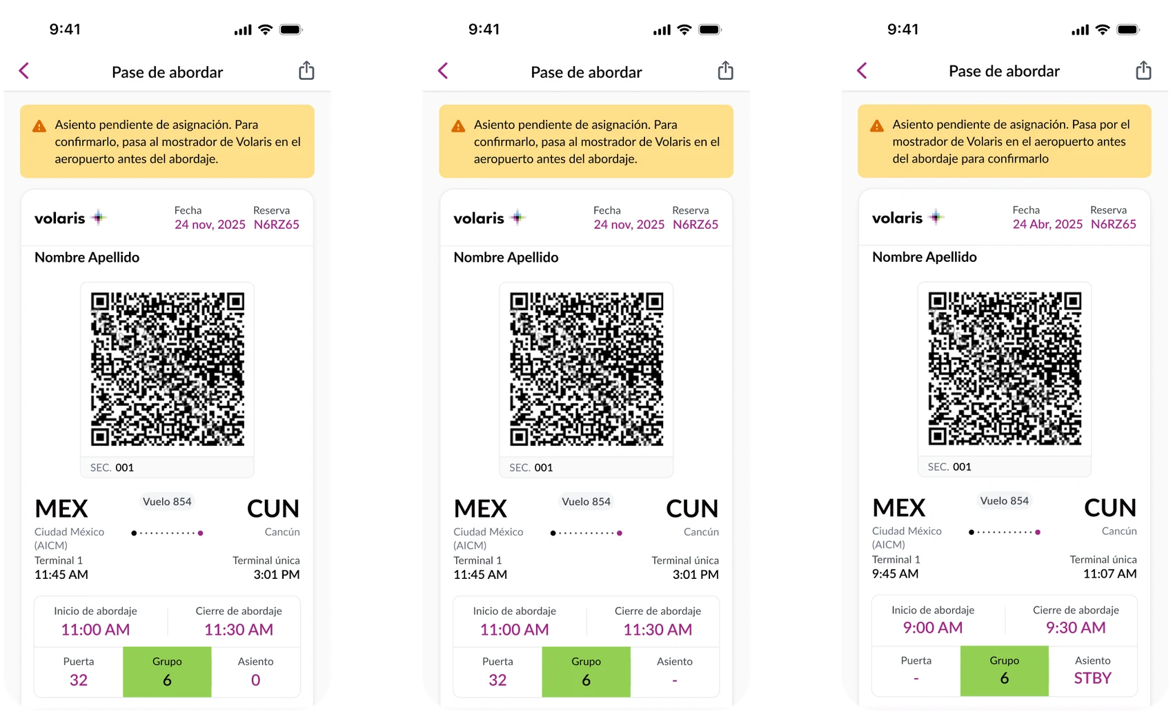
The launch decision was made with the risk on the table. Directors chose to move forward for operational reasons, with a commitment to monitor the experience once live, in both digital channels and at the airport, and adjust iteratively.
That was the right outcome for the research, even though it wasn't a redesign. My role wasn't to block the requirement; it was to make sure the decision was made knowingly, with the emotional cost measured rather than assumed.
What I'd measure next
Counter visits from passengers with a pending seat, seat purchases after check-in, and trust and satisfaction after a real flight rather than in a test.
Reflection
Good numbers can hide a bad experience
Task success and clarity scores alone would have told a reassuring story. It was the qualitative side, asking people how they actually felt, that surfaced the contrast and the real risk.
Delivering bad news is part of the job
It's never easy to tell a team that users don't like something they built. But being honest about what works, what doesn't and what to keep watching is exactly what the role is for. I can't stop the business, and that's not my job. What I can do is give everyone the evidence to make an informed decision.
Honest copy is its own design work
Working with the UX Writer, we shaped the messages so they would inform without alarming, and never promise what we couldn't guarantee. That same principle decided the final detail: replacing the zero with STBY cost nothing and stopped people from believing they had a seat they didn't have.