The problem
When you meet someone who reads the same books you do, it feels like finding a close friend you didn't know you had.
I started this project after moving to a new city, where I didn't know many people. Reading was the hobby I had, and I kept thinking about how much better it would be if the app I used could turn that hobby into a way to meet people. Existing apps handle tracking well, but they leave out the part of reading that makes people want to keep reading: talking about it with someone.
So the question was whether that gap was real for other readers too, and what it would take to close it.
Research approach
Competitive analysis and benchmark
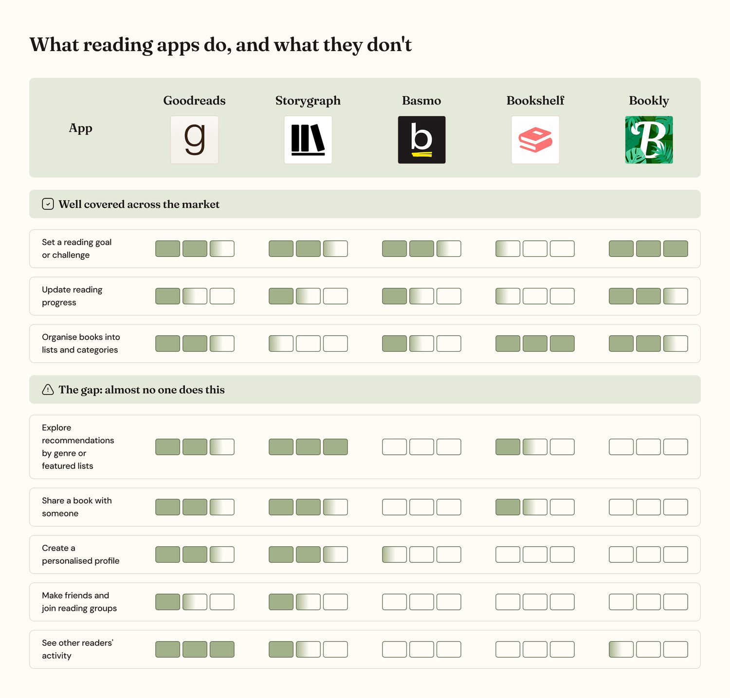
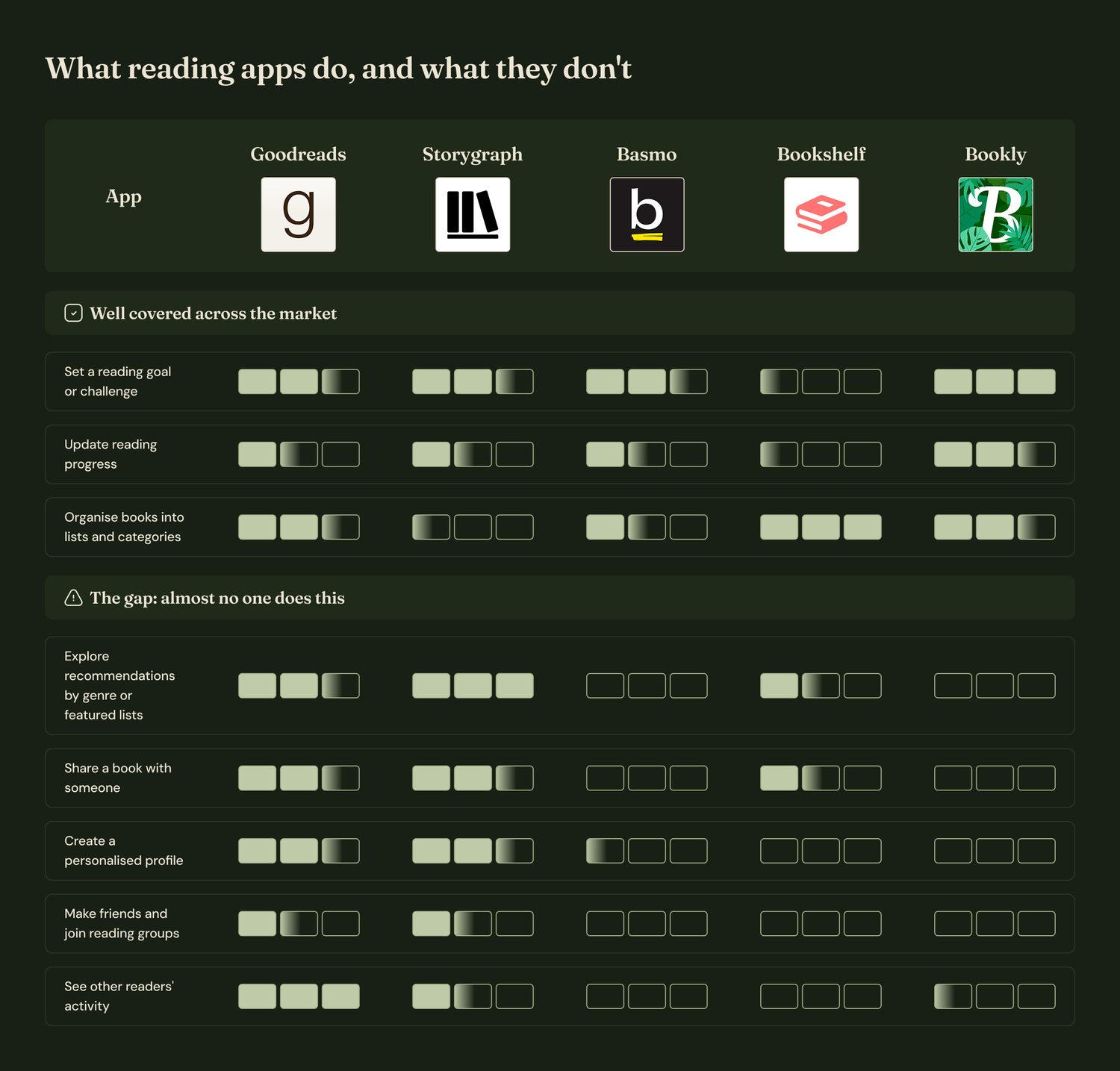
I installed 8 reading apps (Goodreads, StoryGraph, Bookshelf, Bookmory, Bookly, Basmo, Luna, Turn) and used them for several days, then scored each one against 16 user tasks, combining what I observed with what reviewers complained about in the app stores.
Survey
A form shared through social media to recruit participants and take a first read on satisfaction with current apps.
Diary study
Daily entries over 5–6 days, starting with a 15-minute session with each participant to explain the study. I chose this method because reading is a habit shaped by context: where people read, at what time, with what around them. A single interview wouldn't surface that.
Interviews
Follow-up sessions to understand the why behind what the survey and diaries showed.
Key insights
The gap was community, not features
Tracking, reviews and goals were well covered everywhere. Seeing other readers' activity, making friends, joining reading groups and personalized profiles were not.
Readers are alone with something they want to share
Participants didn't have a close group of people who read as much as they do, but they wanted to talk about books with someone.
Goals are symbolic, not operational
One participant put it plainly: the reading goal is more a statement of what they'd like to read than a target they manage. So goals became motivation, not a metric to optimize.
Reading is a multi-format, multi-book habit
People read physical and digital, around 3 books at once, mostly in the afternoon, about an hour at a time. Half save quotes; many use colour codes inside their books.
People want a Spotify Wrapped for books
It came up in the diary study and again in the interviews: a wish to see their reading year reflected back at them.
From insight to design
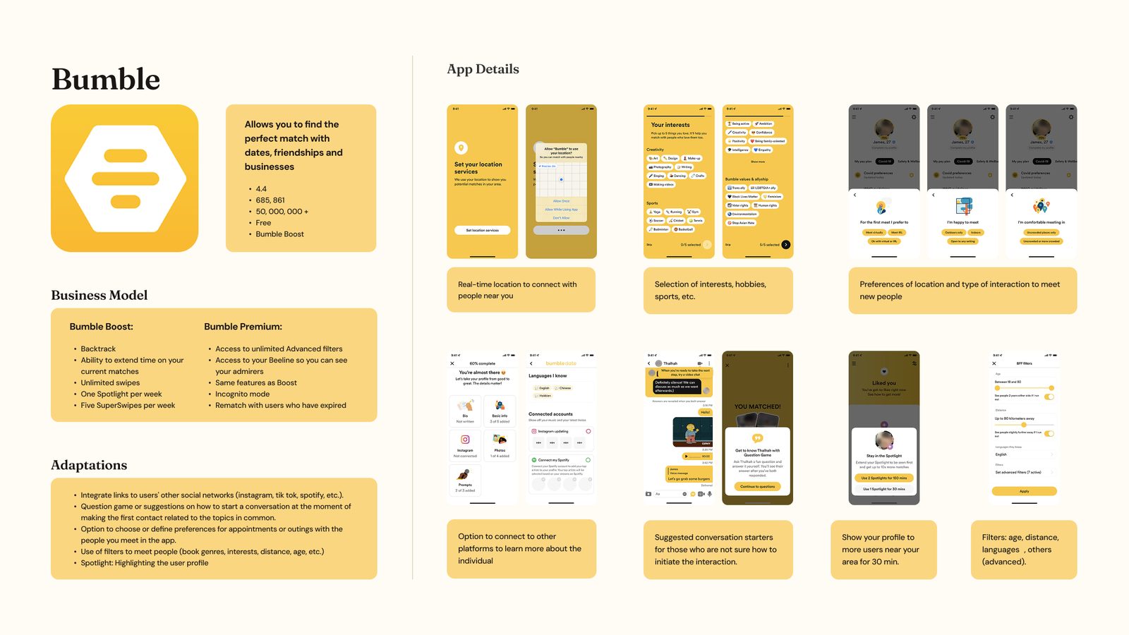
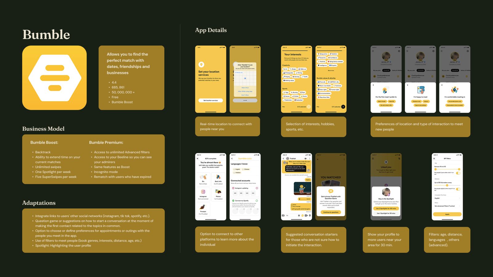
I looked outside my own category. Since the real challenge was connection rather than cataloguing, I studied apps built for connecting people: Bumble, Tinder, Strava and Letterboxd. For each one I documented its business model and, in a dedicated column, how its mechanics could be adapted to a reading context. That's where the question game to break the ice, the interest and genre filters, and the Spotlight-style profile highlighting came from.
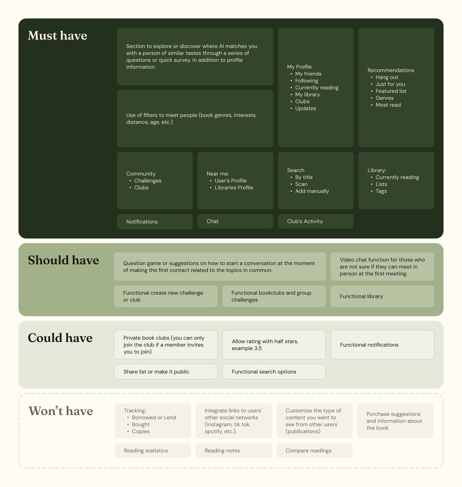
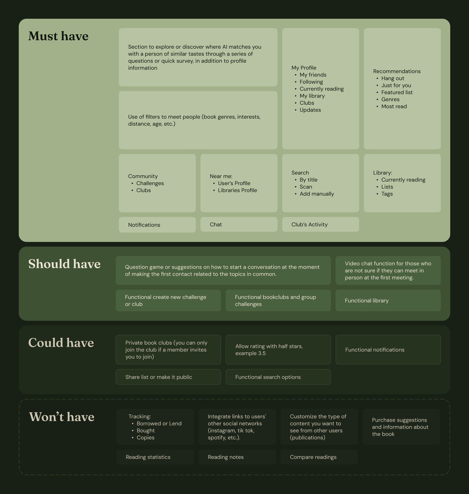
I cut scope deliberately. A MoSCoW exercise kept the MVP to what actually differentiated the product: friends' activity feed, community, "Near me", recommendations, and filters to find people with similar taste. Notifications, half-star ratings and reading statistics went to could-have. Social network integrations and reading notes went to won't-have.
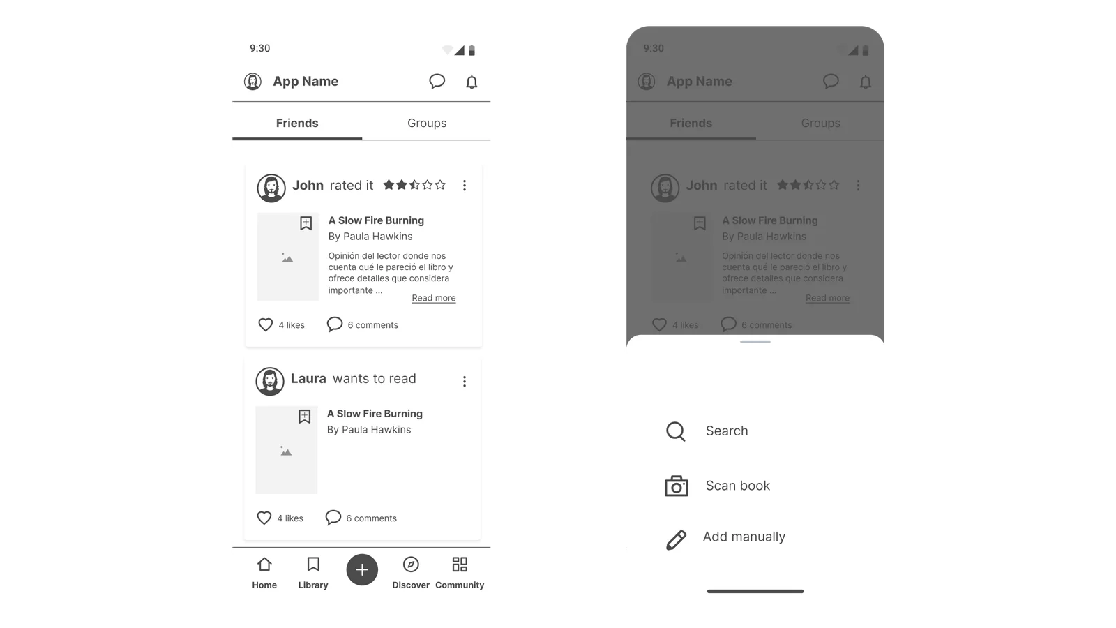
I designed for the hand, not just the screen. In the wireframe iteration, I moved the add-book action from the centre of the tab bar into a floating button: reachable by thumb, accented with colour, and with the background dimmed to remove distractions. Freeing the centre slot also let me add Profile as its own section.
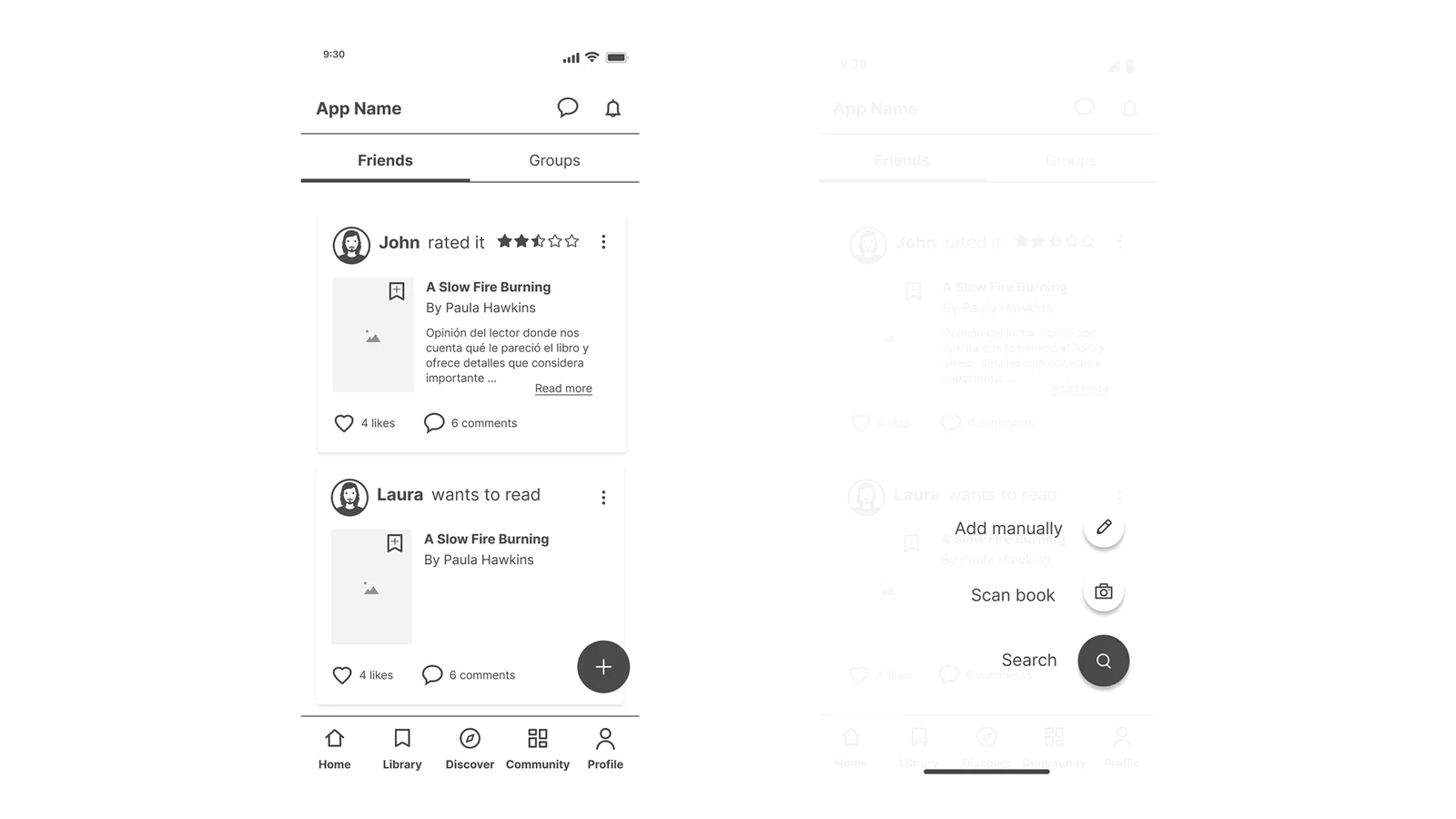
I built a system, not screens. Before high fidelity, I defined the brand (name, logo, palette, typography) and a design system: type scales with line heights, colour ramps from 50 to 900, shadows, blurs, a 4-column mobile grid, an icon set in solid and outline, and a component library organized into atoms, molecules and organisms.
The navigation bar uses a frosted-glass treatment, so the content scrolling underneath stays visible through it and the app keeps a sense of depth without adding weight.
Outcome
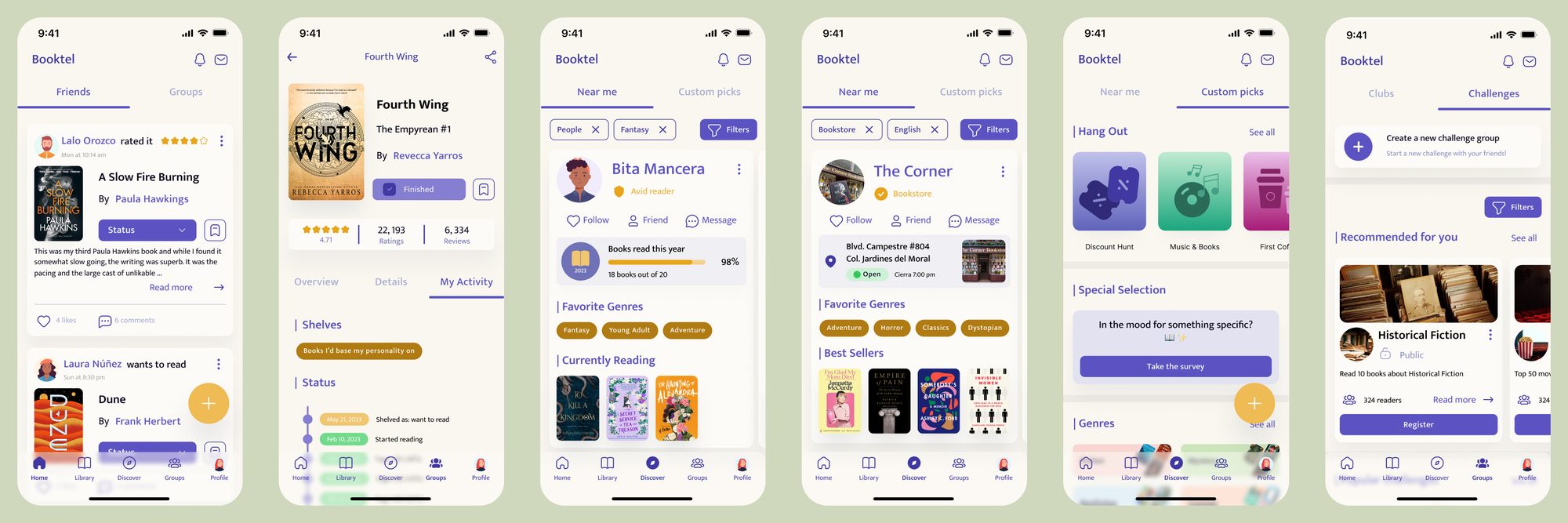
The MVP prototype covers the full experience in Figma: Home feed, Library with challenges, Book detail with community reviews, Search, and a Discover section with "Hang out", "Special Selection" and the question game. It was delivered on time as a complete, coherent product proposal.
Open the interactive prototype
I tested it informally with my roommates at the time, which caught small things. A structured validation round didn't fit in the remaining weeks.
Social reading apps have grown on BookTok for exactly this reason: readers want to talk about books with other people. The gap the research pointed to was a real one.
How I'd approach it today
This was a design project with no development team behind it, so the goal was to take an idea from research to a validated design proposal. Here's what I'd add if it were a real product.
Validate the promise, not just the usability
With the MVP in hand, before launch I'd test whether the product actually solves the problem it set out to solve: does it help readers connect with each other? Alongside that, a structured usability round to catch anything still broken in the flow.
Monitor once it's live
Profile completion, how many users join a club or start a conversation, retention among people who connect with someone versus those who don't, and whether "Near me" gets used at all. I'd also watch for what I wouldn't want to see: clubs that die after a week, or connections that never turn into conversation.
Bring development in from the start
Personalized recommendations, book scanning and a live community all carry real technical and content costs. I had no dev team then, and today I also understand far more about what's behind an app technically than I did when I designed this.
What I'd keep: looking outside my own category for inspiration, cutting scope on purpose, and building the design system before the screens. Those three decisions are the reason a solo 12-week project ended up feeling like a product.