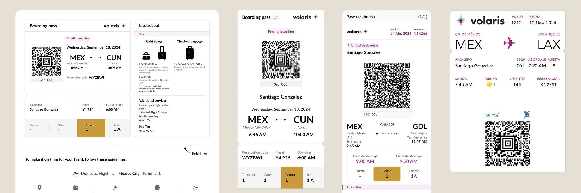
The problem
Boarding at Volaris gates had become a bottleneck. Too many passengers fell into the first boarding groups, so crowds formed at the gate before boarding even started.
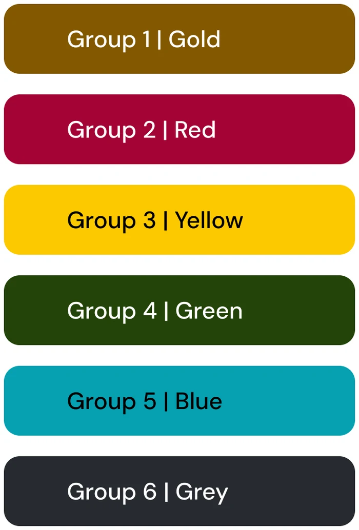
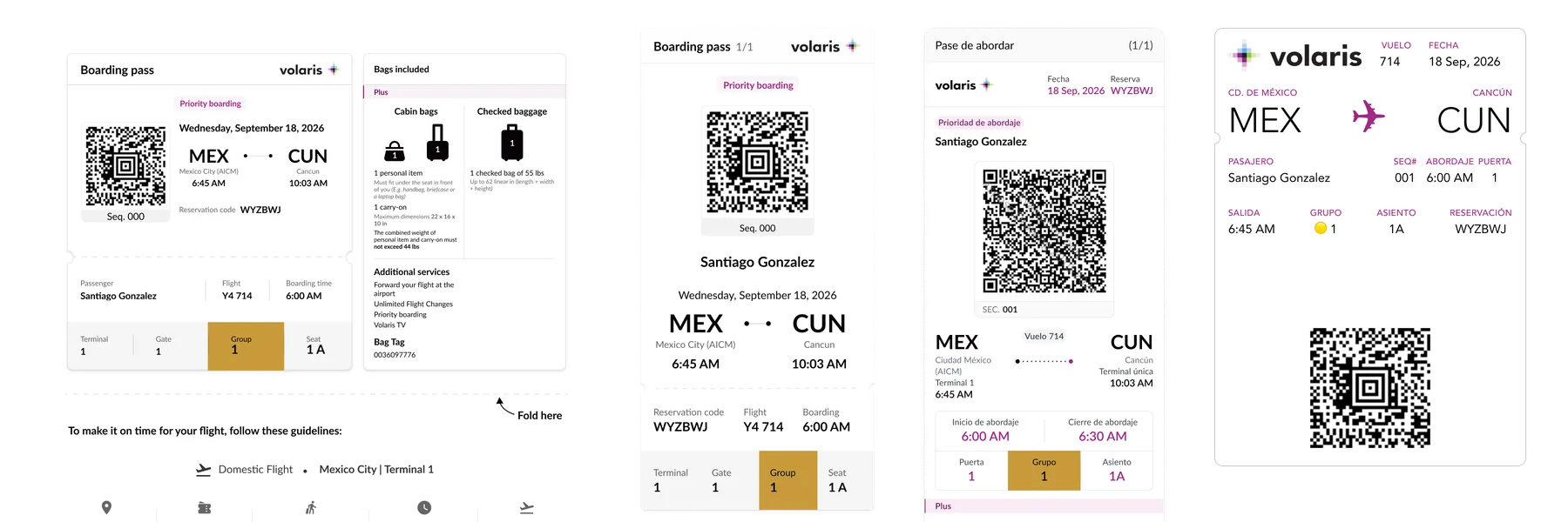
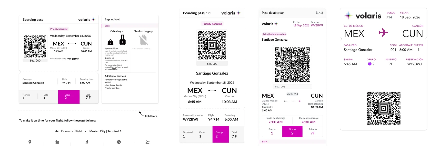
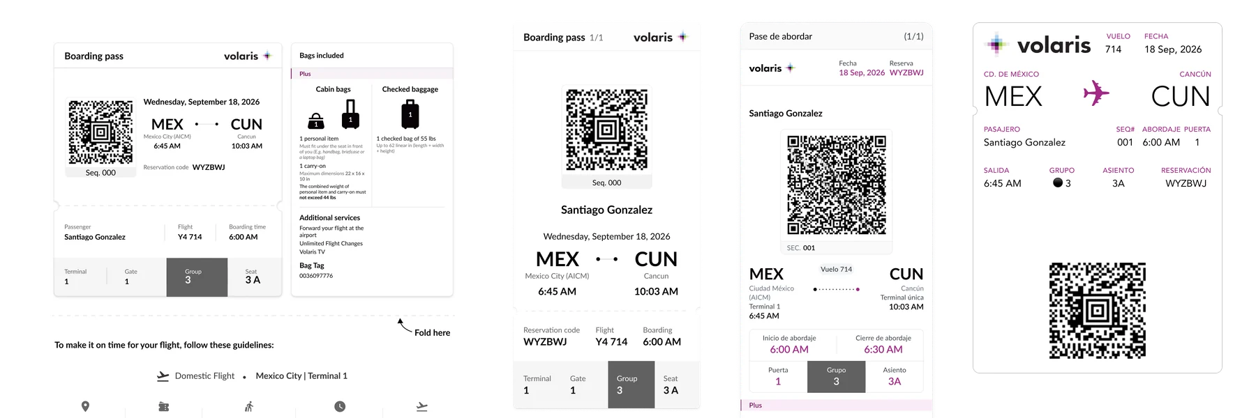
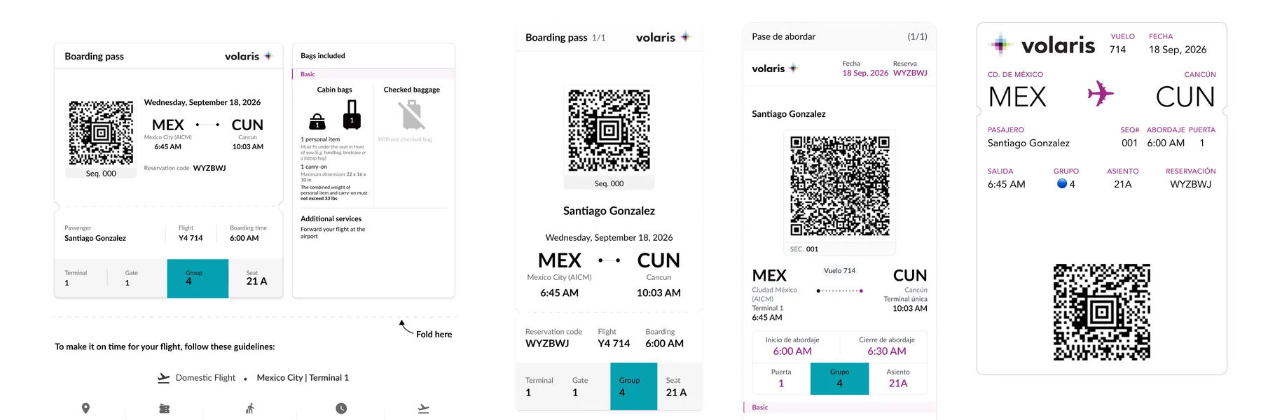
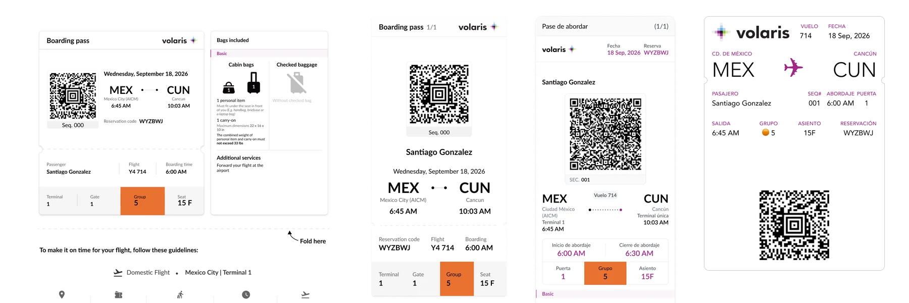
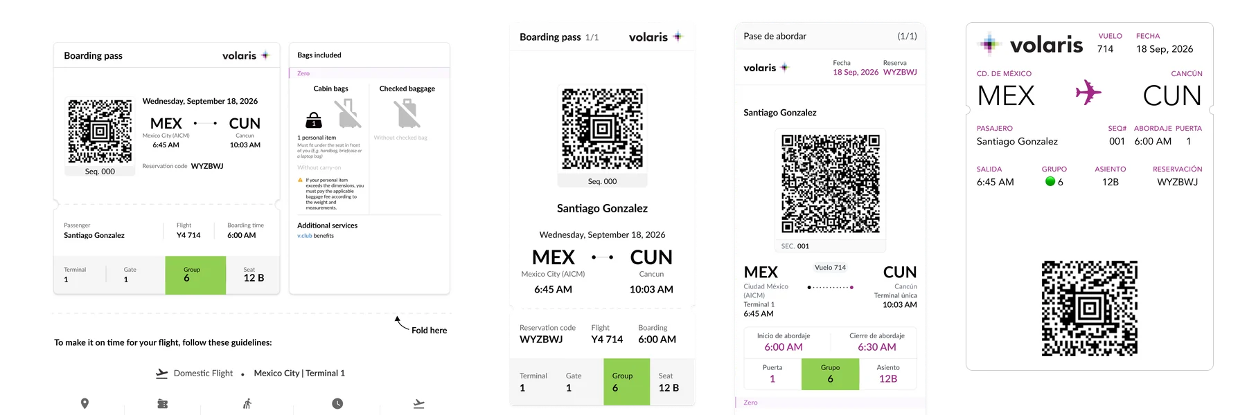
Lines moved slowly, and passengers blocked each other in line and on the jet bridge. To fix it, the airline redesigned how passengers are grouped: six groups, assigned from the seat each passenger has or bought for that trip, the baggage they're travelling with, and whether they paid with an Invex-Volaris card. Each group got its own colour.
But the system only works if every passenger can tell which group is theirs at a glance: on a phone, a printed page or a Wallet pass, and in a crowded waiting area, in seconds.
By the time the project reached the UX team, Marketing and Airport Operations had already defined a palette and signage. Rather than simply apply it, we paused the rollout to validate it with users. Before it reached every channel and every gate, we needed to answer four questions:
- Do passengers notice and understand their group colour?
- Does its placement on the boarding pass change how fast they find it?
- Can they work out their boarding order from colour alone?
- Do any colours confuse people or send the wrong message about priority?
Research approach
I ran the study as a sequence, with each phase answering the questions the previous one raised.
1. Quick validation — March
Unmoderated tests on Marketing's palette, group naming, signage and ColorADD symbols, to catch obvious problems fast.
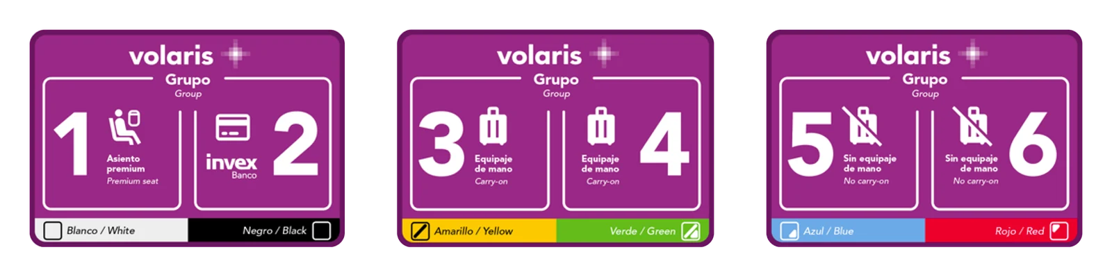
2. Behaviour over opinion — March to April
A moderated matching exercise with 10 participants from three traveler segments: frequent, occasional and infrequent flyers. Instead of asking which colours people liked, I asked them to order the groups, and to name each colour or tell me how they would refer to it. Ordering showed whether colour alone could communicate priority. Naming showed whether everyone was seeing the same colour and calling it the same thing, which is a comprehension check and an accessibility one at once.
3. Real-world habits — May
A survey on how 6 participants actually use their boarding pass on travel day, plus colour differentiation tests and an A/B test of the Wallet pass with and without colour.
4. Cross-channel evaluation — June
Four layout proposals scored on technical complexity, design effort, visual consistency and user feedback, across all four channels.
Key insights
Colour names aren't universal
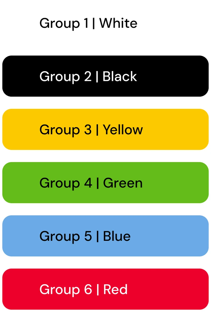
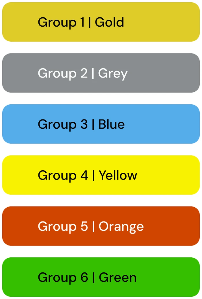
Participants read yellow as gold and gold as brown. Dark grey looked like black and was confused with green. A palette that looks distinct in a design file can collapse in people's minds.
Accessibility had to be designed, not applied
When we adjusted tones for contrast compliance, some became too dark to tell apart. Meeting the standard wasn't enough; the colours also had to stay distinguishable.
Words beat symbols
No participant recognized the ColorADD symbols; they only added a third layer of information to decode. Labels with the full word ("Group 3") were understood faster than numbers alone.
Colours carry meaning
Gold signalled exclusivity, and red reminded users of the airline's partner bank card. Instead of fighting these associations, we used them to reinforce what each group means.
People read top to bottom
Participants scanned the boarding pass from the top down, so placement mattered as much as colour.
The signage could scare passengers
Group 3 was for passengers with a carry-on bag, Group 4 for those travelling with only a personal item. The signage made Group 4 read as if carry-on bags were prohibited, which could alarm passengers right before boarding.
From insight to design
Together with the project's UX designer, I co-designed the final palette and decided where the group colour would sit in each boarding pass format. We worked through it in joint review sessions, both remote and side by side at the office. Every change traced back to evidence:
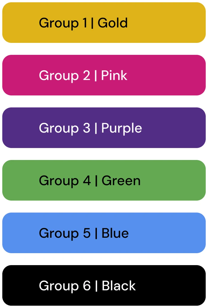
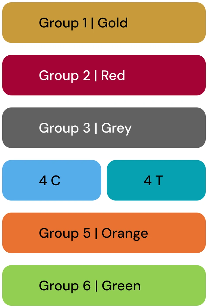
- We removed yellow, since it was constantly confused with gold and felt harsh.
- We tied the priority groups to existing meaning: Group 1 matches the Premium Plus seats and Group 2 uses the partner bank's colour.
- We lightened some tones to separate them from each other and from a competitor's brand.
- We chose turquoise over classic blue; 4 of 6 participants found it easier to spot in a crowded waiting area.
The turning point
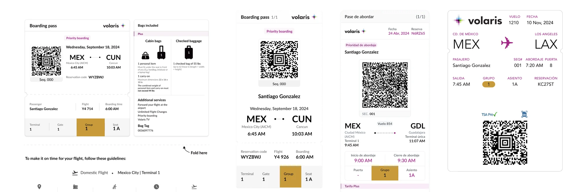
In the final phase, we compared four layouts: QR Strip, Top Strip, Colour Block and Bottom Strip. Participants preferred the strips, calling them more aesthetic and harder to miss.
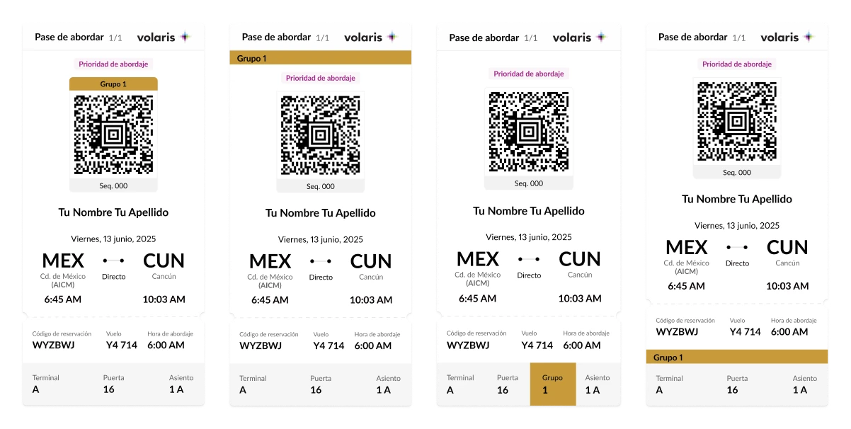
But the Wallet pass changed the picture. We had based our proposals on what other airlines' Wallet passes showed was possible. When we checked with our contact on the app software side, the answer was that colour could be applied to elements already in the layout, though with limits on sizing and on how it could be applied. A strip wasn't possible. So we re-evaluated every option against what we were told could be built. And in the Wallet A/B test, 6 of 6 participants spotted their group first in the coloured version.
The design users ranked lowest was the only one that could work everywhere.
I recommended Colour Block for five reasons:
- It was consistent across all four channels.
- It raised no comprehension issues: users found terminal, gate, group and seat correctly.
- It kept the group in the position users already knew.
- It required only a minor change on Web.
- It gave us the opportunity to fix known bugs in the web boarding pass.
Outcome
Colour Block shipped. The colour-coded boarding groups are live today on Volaris boarding passes across the app, web, PDF and Wallet, and they define how every Volaris passenger boards.
What changed after the research
Two things shifted once the system left my hands. Directors found the red too loud, even though participants read it as the partner bank's colour, so it was swapped for a tone closer to the airline's own brand; that change didn't go back to users for testing. And when the Wallet pass reached the development team, they couldn't apply the colour after all, so that format uses coloured emoji instead. Every other channel ships the colour block as tested.
What I'd measure next
How passengers are distributed across groups, average boarding time per flight, how often gate agents have to redirect passengers to the right group, and support contacts related to boarding groups. The first two connect directly to the original problem of crowding and slow lines.
Reflection
Preference is an input, not a decision
The most-liked design couldn't be built for every channel. My job was to make that trade-off visible, not just report votes.
Accessible doesn't automatically mean distinguishable
Contrast rules and real-world perception have to be tested together.
Bring every affected team in from day one
The project reached UX after Marketing and Airport Operations had already defined their proposal, so validating it meant asking them to reopen decisions. For cross-functional initiatives, I now bring all the teams involved together from the start, so a recommended change is understood as part of a shared, evidence-based process, not a matter of UX taste.
Confirm feasibility with the people who will build it
We designed based on what other airlines' passes showed was possible, then confirmed with our contact on the software side. It turned out the answer we got wasn't the answer the development team could deliver. Now I check feasibility with the team that will actually implement it, not only with a point of contact, and I document known technical constraints so future redesigns start from them.
Validate what we assume, share what we learn
Participants read red as the partner bank's colour, and none of them found it alarming. That finding reached the directors late and without the research behind it, so the change was decided without the context of what had already been validated. Assumptions are valuable, whether they come from design or from any other area, and they belong in the research from the start, so they get answered by the only people who can settle them: the users. The other half is sharing what the research found with everyone who needs it, so they understand why a proposal took the shape it did and can defend the final result when it's questioned.